Cargo Smart Supply Chain Dashboard
All data shown is fictional and created solely for demonstrating structure and decision pathways.
Context
Cargo Smart works with large enterprise clients where supply chain visibility, performance tracking and rapid diagnostics directly affect business decisions.
This project was created as part of an assignment to evaluate whether I can think in systems, create narrative structure for analytics and design dashboards that support real decision makers.
The goal was to design an operational dashboard that answers two questions.
How are we performing?
Why is this happening?
Aim
Create a dashboard that establishes a clean and intuitive information flow.
The dashboard must highlight the right KPIs, reveal meaningful patterns, and structure the interface so that a user can move from a high level operational view to deeper diagnostic layers without friction.
Key Objectives
• Clear heirarchy
• Fast scanning and reduced cognitive friction
• Narrative structure from symptoms to causes
• Filters and tabs that mirror natural mental models
• Interaction elements that support exploration without clutter
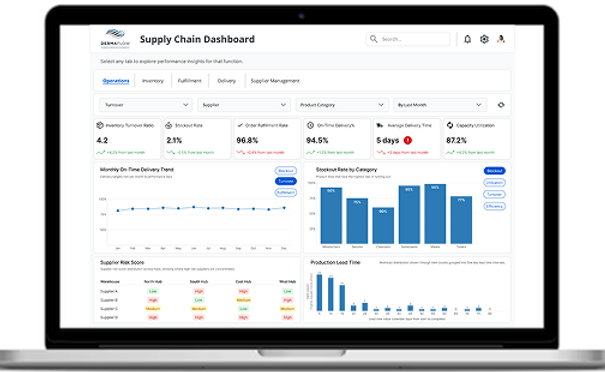
High Level Operations Overview

This screen gives executives and analysts a quick, reliable sense of operational health.
The top row presents the most critical KPIs with directional indicators for immediate pattern recognition.
KPI Cards
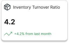


These cards surface the performance indicators that matter most for supply chain decision making.
• Inventory Turnover Ratio
• Order Fulfillment Rate
• Average Delivery Time
Their layout supports fast scanning with consistent typography, clear icons, and color used only for meaningful performance shifts.
Navigation and Filters

Tabs organize the workflow into Operations, Inventory, Fulfillment, Delivery, and Supplier Management.
Filters allow users to break down the data by category, supplier, product line, and time period.
This structure mirrors natural investigative pathways that managers use in real supply chain operations.
Page 1: How is the performance?

Users see system level KPIs, recent trends, and category level breakdowns.
This screen focuses on operational stability. The intent is to surface emerging issues early without emotional noise or visual overload.
Example Insights:
-
Delivery time has increased
-
Order accuracy is stable
-
Supplier risk varies across vendors
-
Production lead time fluctuates by category
Page 2: Why is this happening?

Users shift into deeper diagnostic visualizations that examine inventory patterns, supplier performance, and product movement.
Example Insights:
-
Slow movement in specific product lines
-
Inventory mismatches
-
Categories driving higher stockouts
-
Supplier driven operational risk
This separation of overview and diagnostic layers creates a clear decision pathway that junior designers can follow and replicate.
Design System Overview
Color and Visual Heirarchy

The palette uses blue as the primary base color with green or red used only for performance movement.
This maintains clarity and establishes a stable rhythm across all visuals.
Typography

Open Sans provides the primary hierarchy for headings at 32 and 16 px.
Inter supports labels and structured content in bold, medium, and regular weights.
This combination improves legibility, strengthens system rhythm, and supports accessible scanning.
Outcome
The final dashboard demonstrates:
-
A coherent information flow
-
A clear step by step narrative from overview to diagnosis
-
Strong heirarchy and focused visuals
-
Interaction patterns that reduce friction
-
A design approach suitable for enterprise scale dashboards