Student Performance Dashboard for
a VR-Based Empathy Training Platform
Langara College | Department of Early Childhood Education
Apache Superset, MongoDB

The Project
Langara College's Department of Early Childhood Education was building something genuinely new — a VR-based empathy training platform that places student educators inside immersive scenarios where they practice responding to children from diverse backgrounds and needs. Children portrayed in these scenarios represent a range of identities and circumstances: a child from a war refugee family, a child with autism, a child from an Indigenous offreserve community, among others. The student educators navigate through a series of scenes within each level, making dialogue choices and respondingto prompts powered by an AI natural language model.
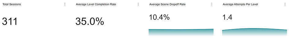
The platform was generating rich data across every test session, user journeys, scene-by-scene responses, level completion rates, and AI model performance logs.
All of it lived in MongoDB, connected to Apache Superset via Trino. But without a structured way to read that data, it was just numbers. There was no single place where the team could look and ask:
-
Is this working?
-
Where are students struggling?
-
Is the AI doing its job?
Why It Mattered?
The challenge with a project like this isn't just building something technically sound, it's making the data tell a story that non-technical stakeholders can immediately understand and act on. The client needed to communicate the value of their platform clearly to:
-
academic leadership
-
instructors tracking student progress
-
future partners evaluating whether the product was worth investing in
Instructors had no visibility into how their students were actually engaging with the VR environment. They couldn't see which scenarios were most challenging, which students were repeatedly struggling at the same point, or whether the AI's responses were accurate and appropriate across different levels.
Without that visibility, there was no feedback loop no way to make the platform meaningfully better over time. The dashboard needed to close that gap.
What I Did?
My role on this project was as an Independent Data Visualization Designer. Beyond building the charts, a significant part of my contribution was helping the client understand what was worth tracking in the first place and how to frame it for the people who would be reading it.
Defining the Right Metrics:
Working closely with the client, I identified the key questions the dashboard needed to answer:
-
Where do students struggle?
-
Is the app teaching empathy?
-
Does a student's avatar identity shape their experience?
-
Is the AI getting better?
These weren't questions the data was already organized around, they emerged from a process of understanding what the platform was trying to achieve and what decisions the stakeholders needed to make.
The tabs read as:
→ Overview & Engagement
→ Performance & Difficulty
→ Where Do Students Struggle?
→ Is the App Teaching Empathy?
→ Does Identity Shape the Experience?
→ Is the AI Getting Better?
A question-driven structure. Rather than organizing the dashboard around chart types or data tables, I structured each section around a specific question.
This was a deliberate design decision. C-level stakeholders and academic decision-makers don't want to spend time interpreting raw data, they want to arrive at a clear answer quickly. Framing each dashboard tab as a question, invites the viewer to engage with the data as a narrative rather than a report. It also makes it significantly easier for the client to walk someone through the dashboard in a pitch or presentation setting. The structure does the storytelling for them.
Building the technical layer & AI:
On the technical side, this was my first time working with MongoDB and Apache Superset, and my first real-world project writing production SQL queries from scratch.
I used Claude AI as a thinking partner throughout debugging complex SQL and aggregation logic, working through data modeling challenges, and stress-testing the logic behind each metric. The queries had to accurately reflect multi-step user journeys across scenes, calculate pass rates by avatar identity and personality type, and track AI model accuracy at the intent-response level.
Chart Selection & Design:
Each chart was chosen to answer its question in the most direct way possible.
A Sankey diagram was used for the scene drop-off view, which maps how students move or stop moving; through the ten scenes in a level. A heatmap was used to surface pass rate patterns across avatar combinations. Bar charts, line charts and donut charts were used throughout to keep the visual language consistent and accessible to a nontechnical audience.

The Results
A critical AI issue surfaced and fixed.
The Scene Drop-off Sankey chart made it immediately visible that students were consistently exiting at Scene 6 across multiple levels. Drilling into the data revealed the cause: the AI was generating irrelevant responses at that point, breaking immersion and causing drop-offs. That finding led directly to a fix changes were made to correct the AI's behavior at that scene.
Instructors gained visibility they didn't have before.
For the first time, the team could see exactly how students were moving through the VR experience. Which scenarios were hardest, where responses were going wrong, and how the AI was performing across different levels and avatar identities.
The question-driven structure changed how the client communicated their product.
What began as a design choice became a presentation tool. The tab structure, framed as questions rather than labels gave the client a clear, intuitive way to walk stakeholders through their platform's performance without getting lost in the data.
Client feedback improved the design.
When the client flagged that descriptive chart titles were giving away conclusions before the viewer could form their own, I reworked the entire structure to invite exploration instead. The final dashboard respects how different audiences want to engage with information. A distinction that matters in a stakeholder-facing product.
The dashboard delivered clarity from raw, unstructured data.
With session logs scattered across MongoDB and no existing reporting layer, the end result was a multi-tab, decision-ready dashboard that translated complex user journey data into a coherent story, one that non-technical stakeholders could read and act on immediately.
Closing Thoughts
This project was a genuine first on multiple fronts. MongoDB, Apache Superset and production SQL queries, all at once. But the biggest takeaway wasn't technical. It was learning that the most valuable thing a data visualization designer can do is ask the right questions before touching the data. The question-driven structure that defined this dashboard came from listening carefully to the client and understanding their audience, not from the data itself. That's a lesson I'll carry into every project that follows.