My First Future Fridays: Exploring AI for Data Visualization
- Aman Singh

- Mar 2, 2025
- 3 min read
Updated: Jul 15, 2025

A few weeks ago, I joined my first Future Fridays session, an initiative by the Data Visualization Society and hosted by infogr8. This was an opportunity to connect with a community of designers, analysts, and storytellers exploring the intersection of data and design. What made this experience even more exciting was diving deep into artificial intelligence and its role in data visualization.
One statement from the session stuck with me: AI will not replace you, but a data designer using AI might. This perfectly encapsulates the direction the industry is moving toward—AI is not here to take our jobs, but those who leverage it effectively will have a significant advantage. Over the weeks, I explored various AI models and their strengths when applied to data analysis and visualization.
Exploring AI Models

We tested different AI models to analyze datasets, generate insights, and even create visuals. Each AI had its own unique capabilities:
OpenAI (ChatGPT) – Best for long-form text responses, useful for generating detailed explanations and summaries.
DeepSeek – A newcomer in the AI space, still under development, but capable of delivering strong performance at a fraction of the cost.
Claude – An analytical powerhouse. It excels at breaking down complex problems and providing structured responses, often in bullet points. It is also surprisingly good at writing code.
Google Gemini – The rich kid with all the latest gadgets. This AI model had access to a wealth of information and could integrate various data sources effectively.
Using these AI models, we explored the Tech Layoffs Dataset from Kaggle. We uncovered trends across industries, but one key limitation we acknowledged was that we did not have data on hiring at these companies. This meant we could not accurately determine what percentage of the total workforce was laid off—highlighting an inherent bias in the data.
Generating Visuals with AI
During the second and third weeks, I took a step further and experimented with Claude’s Artifacts—its capability to generate visuals based on data. The results were surprisingly accurate. It interpreted data structures well and created coherent charts and graphs.

However, I encountered some challenges when trying to generate certain types of complex visuals, as Claude seemed limited by the version it was running. Despite this, it was an eye-opening experience in using AI as a co-creator for data storytelling.
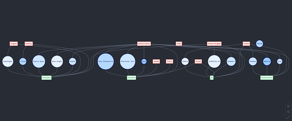
Crafting a data story using Flourish (view story)

For our final assignment, we had to craft a data story. I chose to create mine using Flourish, an online tool designed for interactive data visualization.
My Experience on using Flourish
As a first-time user of Flourish, I found the experience incredibly smooth. A few key takeaways:
Easy to use for someone with little to no experience in coding. The platform provides a user-friendly interface that does not require advanced technical knowledge.
Once you understand how the data is formatted for each visual, the rest of the process is a cakewalk. It is all about getting the structure right—after that, creating visuals becomes intuitive.
A great online tool for making interactive visuals for the web. The interactivity features make it engaging for users and ideal for web-based data storytelling.


Comments